
A brand’s identity is a significant driving factor in its success. Brand identity includes the visual elements that develop an intended image in the consumer’s mind and set it apart from the competition.
Photography plays an integral role in creating or emphasizing a brand’s identity, and color schemes and lighting are key factors. Learn how color and lighting can set the tone for your brand while influencing customer thoughts and behavior.
Colors Evoke Thoughts and Emotions
Color psychology is the study of color and how it affects behavior. Certain colors, tones, and hues can influence a person’s mood and choices. Understanding color psychology is essential when choosing your brand’s color scheme. Your logo and brand colors are some of the first and most recognizable aspects of your brand.
The following are several popular brand colors and the emotions or actions they promote.
- Red: Red is associated with power, passion, fearlessness, and excitement. A world-renowned brand using the color red is Coca-Cola. Red is often used to call consumers to action, such as by urging purchasing a product. It can also evoke feelings of hunger.
- Blue: Blue is a generally beloved color around the globe. It is associated with trust and stability. You’ll notice that many health insurance companies and financial institutions, like BlueCross BlueShield, Cigna, Barclays, and Chase, use blue for their logos to inspire feelings of trustworthiness and security.
- Green: Green is often associated with nature, health, growth, and energy. Companies like Whole Foods use green to highlight their brand as healthy, natural, and fresh.
- Orange: Orange is a playful color viewed as friendly and fun. Some companies use it in place of red to remain eye-catching while offering a more lighthearted feel. Nickelodeon is known for its iconic orange logo.
- Black: Companies using the color black for their brand identity want their customers to see them as modern, sophisticated, or serious. It’s also used to elicit feelings of security, strength, or power. Prada, Louis Vuitton, Gucci, and L’OREAL, are known for using black.
Color in Brand Photography
Your brand’s colors portray a message to your customers and prospective customers. They can also affect the purchases consumers make. Keep this in mind when taking photos for your website, promotions, social media, and more.
Bright and warm photos promote many of the same emotions as bright colors, such as red, yellow, and orange. They provoke feelings of happiness, fun, liveliness, and optimism.
Photos with dark and cool tones create more dramatic effects, bringing out more intensity and moodiness. Black and white photos are some of the most intense, generally signaling sophistication and an artistic quality.
Monochrome photos, with one color theme or filter, can help promote your brand identity with a uniform look and feel.
Lighting in Brand Photography
Lighting is just as capable of portraying messages and evoking emotion as color.
Soft and natural lighting are generally more youthful and fun, while hard lighting and split lighting with high contrast are dramatic. Backlighting can also add a dramatic feel or simply highlight a specific product.
The way you light the subject in your photos elicits certain feelings among consumers. Generally, lower contrast lighting with minimal shadows portrays an upbeat, positive feeling. High-contrast photos provoke feelings of drama, romance, intensity, or sophistication.
Use the contrast that best suits the brand identity you want to promote.
Color and lighting are essential parts of developing or promoting your brand identity through photography. Hiring a professional business photographer can ensure you portray your desired brand identity through your product photos, advertisements, social media posts, and more.
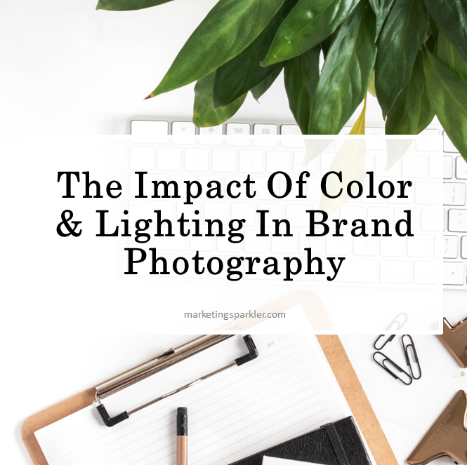
For more information about the importance of color and lighting in your brand’s photography, take a look at the infographic below.
Infographic provided by Jonathan Young Photography, a Los Angeles corporate photographer
Ciao,
Miss Kemya
This is a guest post from Jonathan Young of Jonathan Young Photography, a Los Angeles-based commercial photographer who creates clean and inviting images of people, food, and products that help to position them at the top of their genres.