
Driving traffic to your website isn’t enough. You must convert site visitors into buyers, increasing revenue and improving your return on investment (ROI). Companies spend thousands of dollars on content marketing, social media coverage, and web design. You want those efforts to pay off in new customers by designing for conversion rates.
According to Internet Live Stats, there are approximately 1.9 billion websites at the moment, although the number of live sites varies widely. People get online to a myriad of content, advertisements and social media distractions. If you don’t use a few web design tricks and apply design for conversion purposes, you risk losing them.
So how can you best design for conversion? These top web design tricks will move your users through the sales funnel and turn browsers into subscribers. Here’s how:
The Top 6 Web Design Tricks that Drive Conversions
1. Make Navigation Intuitive
You’ve probably heard competing advice about website navigation. Some experts say to nix the menu bar, while others want you to place it in a unique location or use fancy scripts. People often utilize your nav bar to familiarize themselves with your site. It serves as a placeholder that helps them find what they’re looking for as they browse your pages.
It’s probably best to stick with a traditional, top of the page menu. Limit the number of items available by using categories and subcategories. Include a link back to the home page as a placeholder.
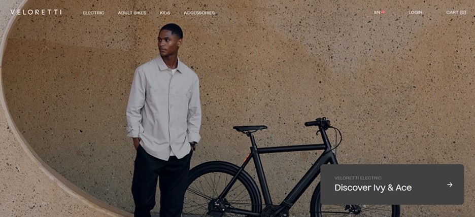
Veloretti offers electric adult bikes. Note how the main focus is the hero image with a man standing in front of one of their products. However, a menu rests unobtrusively across the top of the page. As the user moves through the pages, the menu remains the same.
2. Design for User Experience
When looking at your site within the framework of the experience you’d like to create, always consider your user first. Truly customer-friendly sites consider the different ways people might interact with the page, such as mobile or desktop.
You must know your typical customer well. Understand their needs and you’ll create a more intuitive site that solves their pain points.
3. Ramp Up Your CTAs
The calls to action (CTAs) on your site can make or break your conversions. Does the CTA button direct users to their next step? What are they most likely to do when converting from a browser to a lead?
Choose the right words and location for your button and you’ll see increased conversions. Try different combinations, placement, working and colors until you find the one that works best for your audience. Keep in mind, color contrast ramps up responses. Use split or multivariate testing to see which works for you.
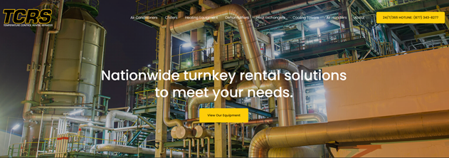
Temperature Control Rental Services uses a CTA button in the upper right corner that encourages people to get in touch 24/7. When customers have an emergency, they’ll turn to you first if you offer a similar around-the-clock service.
4. Limit Clutter
What is the objective of your page? Remove anything that doesn’t point visitors toward where you want them to go. Ideally, a page would just have some information with everything pointing toward your CTA.
If you want people to sign up for a newsletter, limit the other options on the site. Use features such as arrows, images with people looking toward the CTA button and bold colors to draw attention to the action you want them to take.
5. Utilize Video
According to Cisco, streamed video made up 82% of all internet traffic last year. People adore video as a way to absorb information quickly and with little effort. A picture is worth 1,000 words. Companies can say a lot more with a video than text alone. Adding some company history, an explainer video or how-tos to your website engages visitors and keeps them there long enough for them to convert.
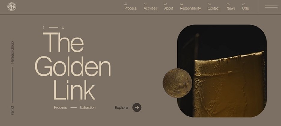
Argor-Heraeus adds a video to the left of their process of refining precious metals. The video appears as you scroll the site, showing people in special suits and using equipment to create beautiful finished products. The video grabs the user’s attention and makes them stick around long enough to learn more about the company and hopefully convert into a customer.
6. Know Your Unique Value Proposition (UVP)
What do you offer that your competitors don’t? You need to think of your UVP in terms the user cares about. They might not care that you’re the largest in your field. However, they’ll take notice when you explain how your reputation allows you to negotiate better pricing for them and save them money.
There are many different types of UVPs. You might focus on the quality of your product, your experience in the industry, lower prices or better customer service. The key is understanding where you excel and how it helps your clients.
Final Thoughts: Speed, Aesthetics and Clarity
When it comes to driving conversions, you must consider all the traditional aspects of excellent design. Make sure your site loads quickly and everything functions as expected. Create a beautiful site people enjoy looking at. Many will simply leave a site that isn’t aesthetically pleasing. Be clear about the information you offer and avoid industry jargon.
Get as much feedback as possible from other web designers, business owners and your customers. Implement what makes sense for your brand and throw out what doesn’t. With a few extra tweaks here and there, and plenty of testing, your site will be one of the highest converting websites in your industry.
Ciao,
Miss Kemya